Singapore Institute of Architects
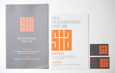
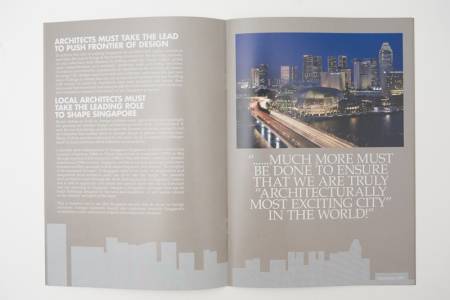
In early 2007, Singapore Institute of Architects (SIA) approached us to re-look their identity. Our first thought: we love their logo! Blocky, monolithic; these were some of the words that we thought straight away. SIA was the sole representative for the architectural profession in Singapore, and we wanted to represent that feeling of stature and authority in their identity.
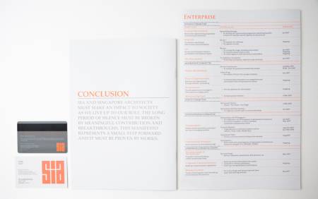
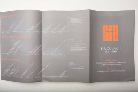
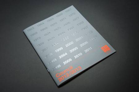
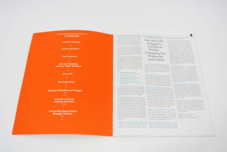
To complement the orange of the SIA logo, grey was chosen. The logo also began being featured prominently, usually in quite a large proportion to the print dimensions. Fonts were reverted to classic serif typefaces.
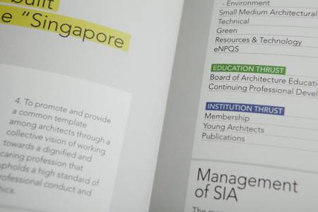
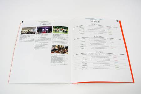
The collaterals which we applied the identity to included namecards, manifesto booklet, membership cards, and brochures, amongst others.
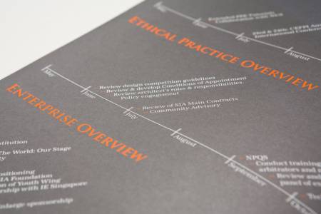
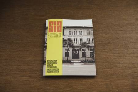
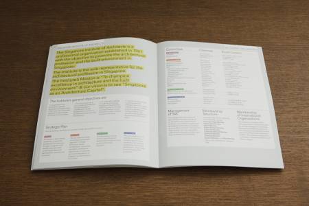
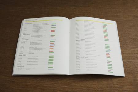
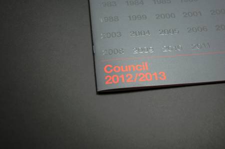
In subsequent years, we integrated the identity onto their Council Booklets.
