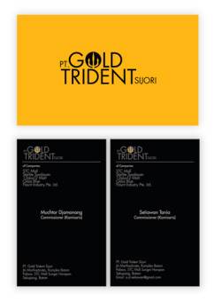
Gold Trident Sijori
For
Gold Trident Sijori
In
1970
Scope
Identity
Brief
To create an identity for Gold Trident Sijori, which was a parent company for a couple of unrelated businesses. The client wanted something that was forceful and strong, to symbolize the strength of the company and its aspirations. The usage of the colour gold was also a must, and the trident (a three-pronged spear) was to be used as well.
Keeping in mind the clients preferences, without cramming in too many of them, a very modern and colour-based approached was mooted . The heavy usage of black and gold coupled with the logo strove to reflect the dignity in which the company was aspiring to be regarded for. A stylized trident was designed into the “O” in “Gold”.
