Archifest
Print Design
Illustration
Web Design
Web Development
Archifest (Architectural Design Festival) is an annual festival for a city to celebrate the built environment. We design the identities for 2007 to 2012, and 2016.
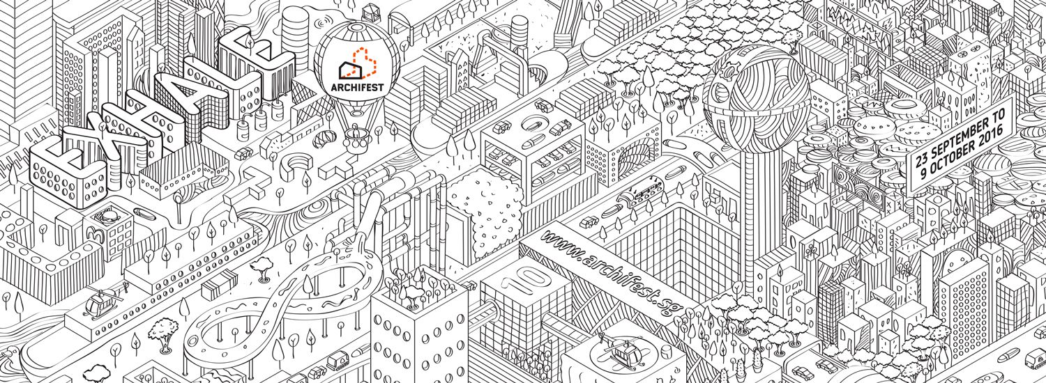
Archifest 2016: Exhale
Having seen the rough design of the Archifest festival pavilion, we were inspired to create a key visual of a city. This city looks like our own city, but has stuff that doesn’t exist yet; lots of greenery, solar panels on building roofs, cycling paths and?lots of pedestrianised roads! We put in as many aspirational ideas for a future city as we could! We decided to have a ‘black & white’ key visual also to allow the readers who pick up the brochures to colour it themselves if they wished.
The theme of Exhale is evident in this colouring-book approach: we wanted the reader to pick up a brochure, take a breath, and have a meditative and reflective moment while colouring the brochure.

Marketing collatorals for Archifest 2016 include T-shirts, fans and brochures.

Brochure: Folded Cover

Opened brochure. Printed on woodfree paper so colouring with all sorts of colouring materials is possible!

Reverse side of brochure


Straits Times newspaper advert.

Dri-FIT T-shirtl

Key visual as digital backdrop

Instagram user's entry for colouring competition

Instagram user's entry for colouring competition

Exhibition panels in Pavilion
Archifest 2012: Rethink Singapore


Archifest 2010: Happy Cities
“Happy Cities” postulates a more refreshing way to benchmark quality built environments and sustainable urban settings.
Measuring happiness is hugely subjective. There are so many ways of measuring a cities? happiness: GNP, GDP, Happiness Indexes, etc. What we propose in our design is using the idea of measuring happiness as a starting point. There is a certain obsession with top 20 lists, indexes, and scores, with complicated formulas and theories, after which the cities are ranked. We represent the act of quantifying happiness with the act of measuring; the length of satisfaction, the weight of discontent, the heights of our bliss and the depth of our misery.
Initially, we used measuring instruments (measuring tapes, weighing scales, etc) as the graphic focus. We settled later on using visual representations of measurements instead; Bar Charts, Graphs, Venn Diagrams, as our graphic focus. The basic print colours of CMYK was chosen as the colour palette. When the visuals of the bar charts, and venn diagrams crossed over each other, different colours like green and purple resulted.


Archifest 2009: Architecture for Humanity
Apart from the exhibitions, forums, tours and fringe events, a major portion of Archifest this year was the Photography Competition. The public was encouraged to pick up their cameras, and capture their own interpretation of the theme.
We used photography ourselves in our design for the identity and collaterals. Han was engaged to take photos island-wide with a simple brief: Capture as much sky + buildings as possible.


The website featured different backgrounds at different stages of the festival.


Archifest 2007: Inaugural edition
This was a precursor for Singapore Architecture Biennale in 2010. The main aim is to promote the right conditions for the breeding of a vibrant design culture and therefore a design conscious society. Hence the brief was to create a strong identity for the inaugural festival.
Our design approach was to reach out to the everyday person, as design festivals usually attract only those who are in the industry. We wanted to get to the man on the street, hold him and shake him and tell him about Archifest, and to learn more about it! Short of doing that, we decided that the everyday idea of the humble notice board and hand-delivered flyers was suitable for disseminating information. After all, the built environment is something that affects us all.

The main identity ? Noticeboard

The idea behind the ?Revision Cloud? logo was that many in the architectural field rely on the revision cloud on building plans to annotate something that needs to be changed. Hence, Archifest, as an event and as a concept embodied by its logo, should


